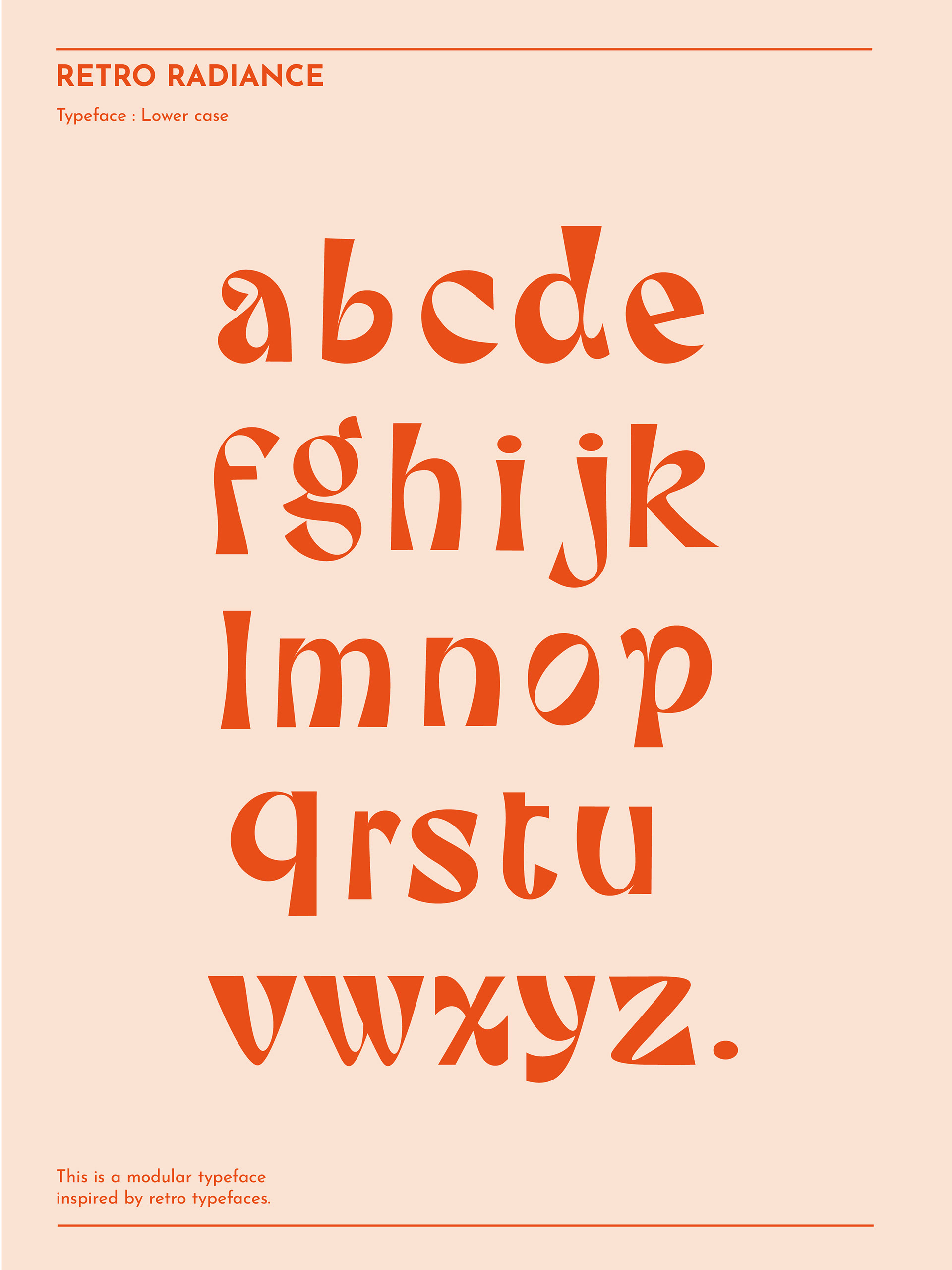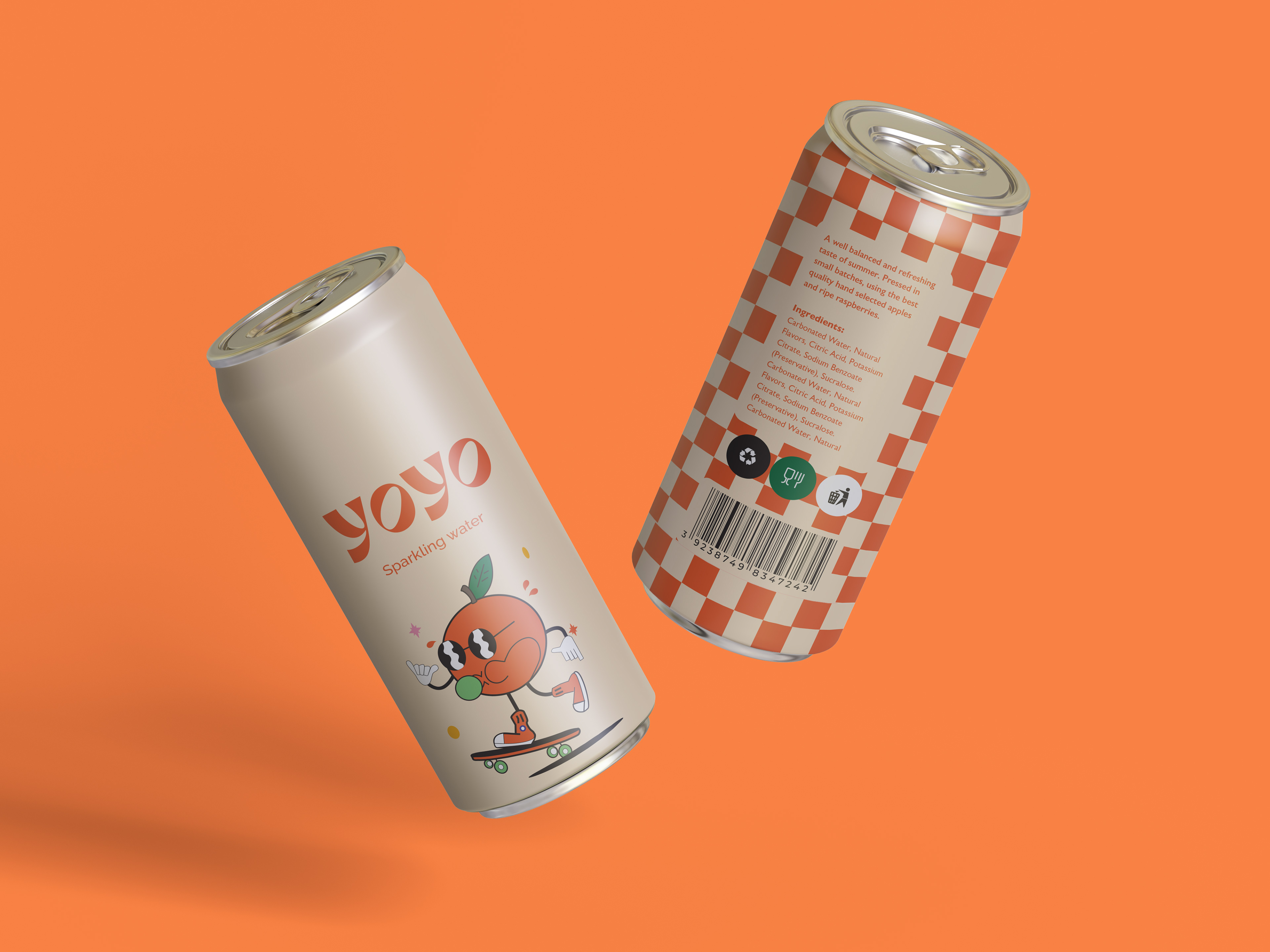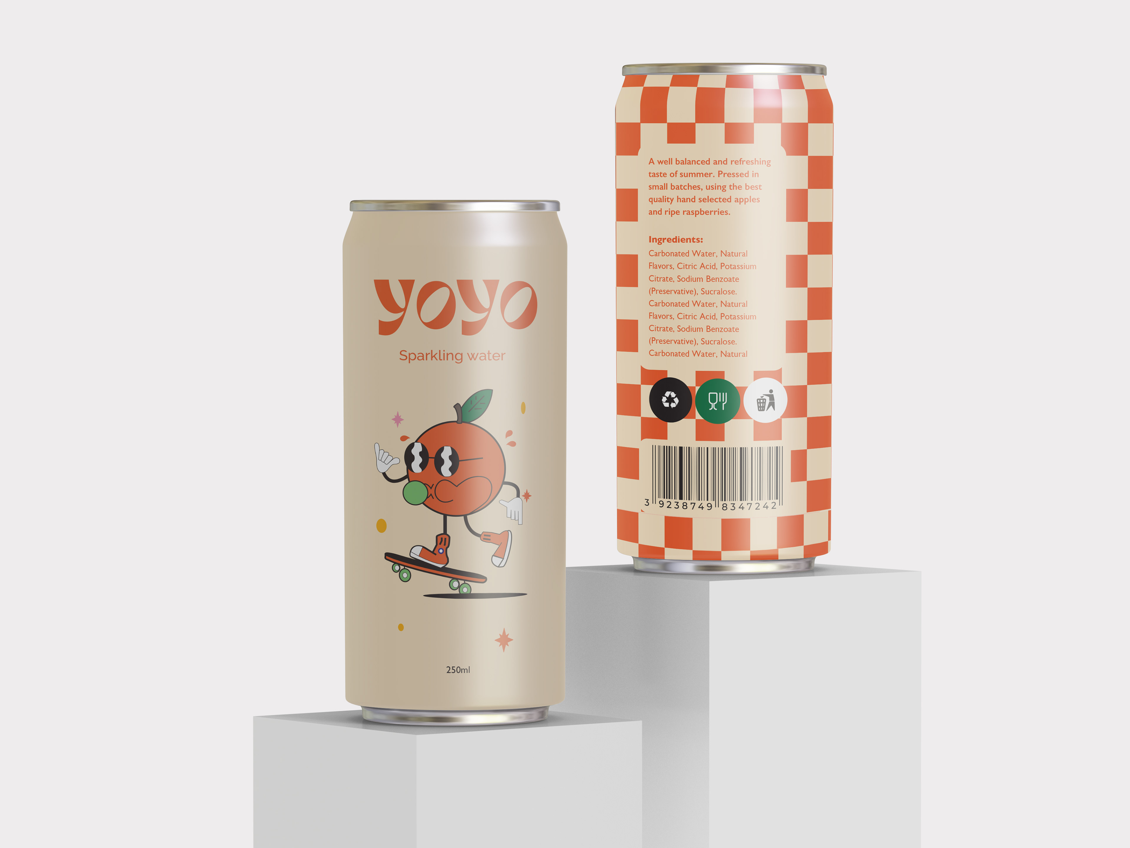
During the "Typeforms" module, I embarked on an exciting journey to create the Retro inspired typeface, capturing the essence of the compact retro-style font. Embracing both upper and lower case, I focused on its captivating impact in lowercase. This typeface is specially designed for packaging and posters.
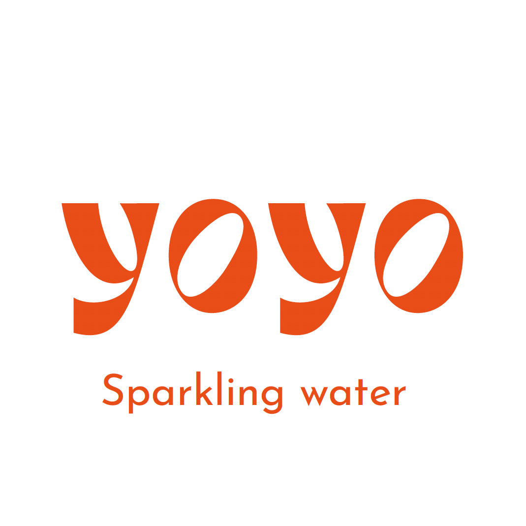
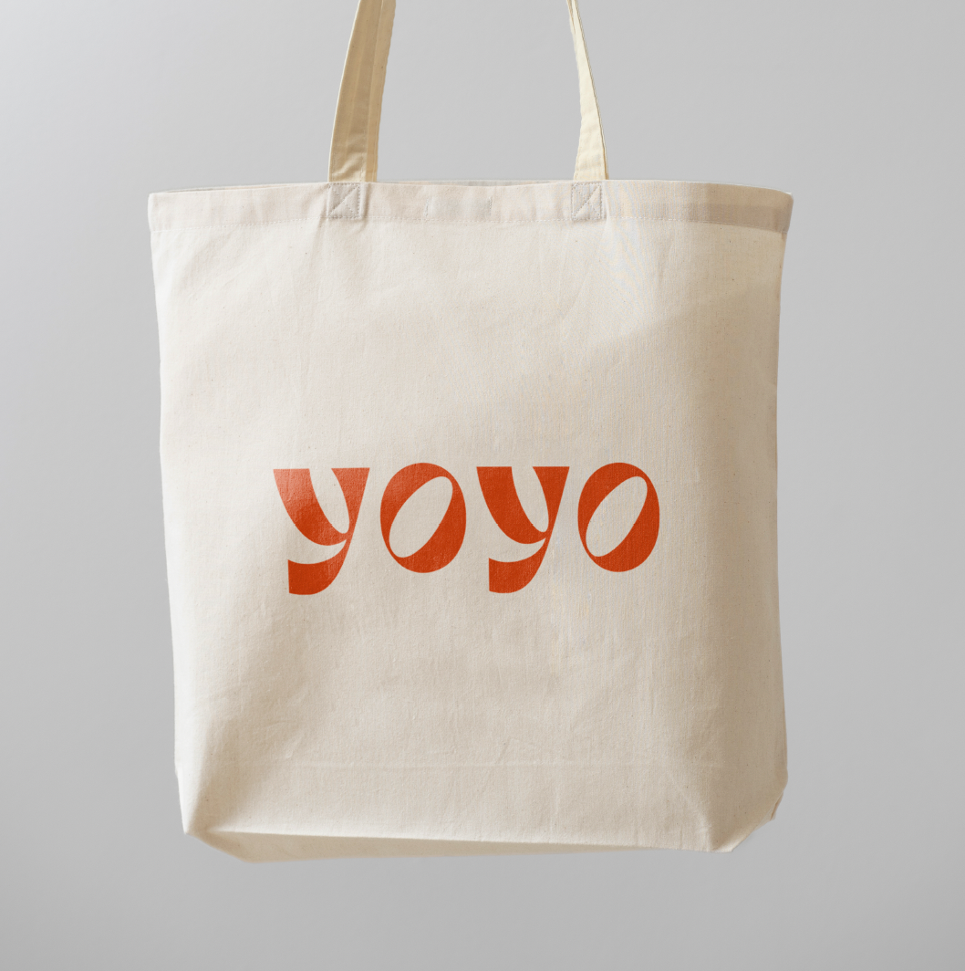
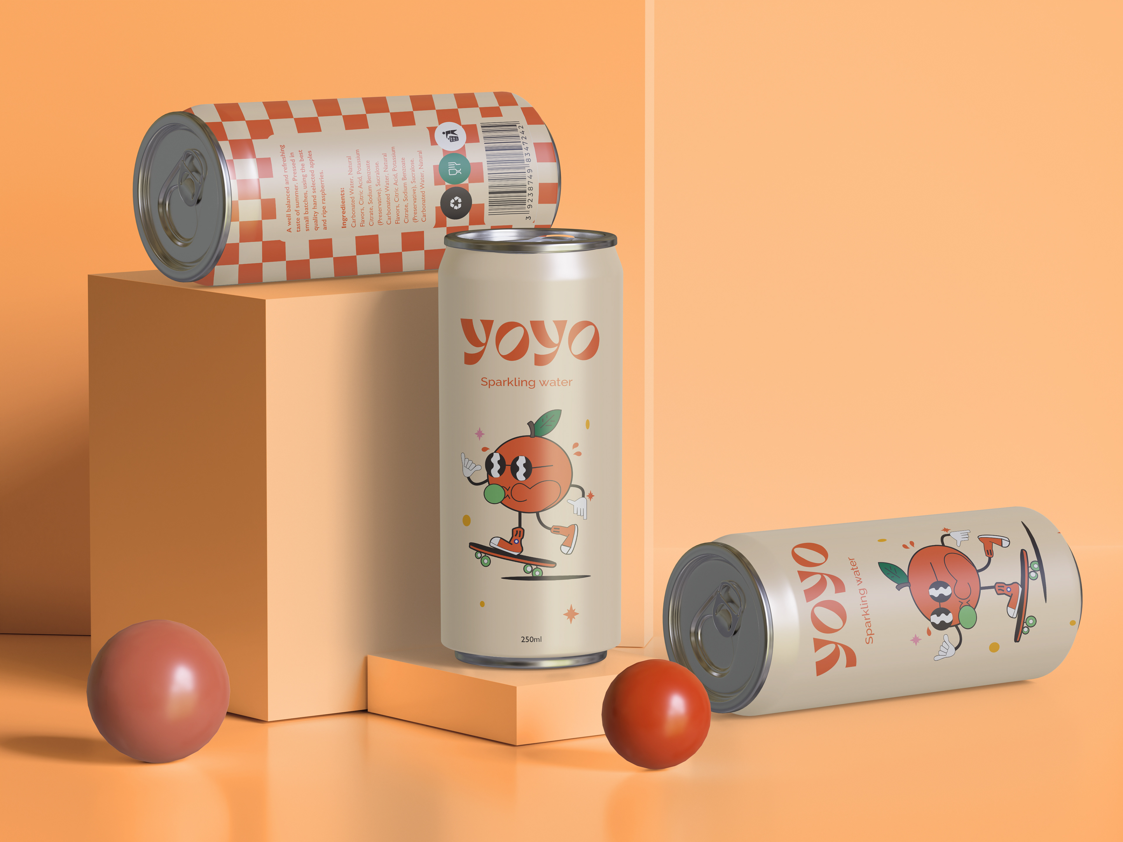
The creative process began with hand-drawn sketches of each letter, meticulously measured with the aid of a ruler. Utilizing the Glyphs app, I breathed digital life into these sketches, refining and perfecting each character. The result was a typeface that exuded the allure of retro aesthetics. To put Retro Radiance to the test, I designed mesmerizing retro packaging that showcased the font's full potential. From vibrant colours to nostalgic imagery and illustration.
Throughout this project, I faced the challenge of ensuring uniformity in corners, angles, and measurements for every letter. It was crucial to establish a cohesive relationship between each character, resulting in a cohesive and harmonious typeface. The Retro Radiance typeface proved to be more than just a design project; it was a journey into the nostalgia of bygone eras, celebrating the captivating beauty of vintage typography. The font's versatility and visual impact make it a timeless addition to any creative project.